Top Tools for Beginner Graphic Designers
October 12, 2024
Common Mistakes to Avoid in Graphic Design
October 12, 2024Choosing the right colors is one of the most important aspects of graphic design. Colors not only affect the appearance of the design, but they also play a big role in how people interact with it. Colors can evoke specific emotions and communicate subtle messages. In this article, we’ll discuss how to choose the best colors for your design to make it more impactful and professional.
1. Understand the Psychology of Colors
Each color carries a certain meaning or psychological effect. For example, blue symbolizes trust and calmness, while red is associated with energy and excitement. It’s important to understand the meanings behind colors and choose ones that align with your design’s message.
2. Use the Color Wheel
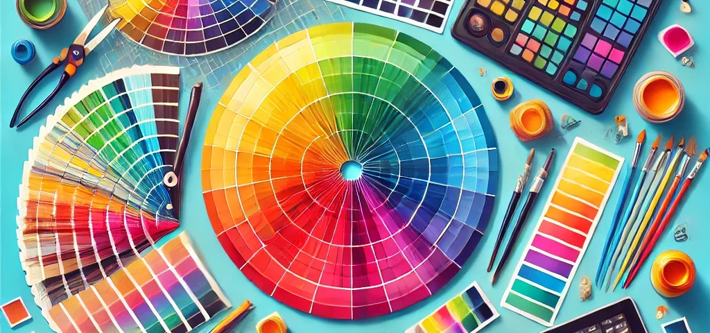
The color wheel is a powerful tool that helps you coordinate colors with each other. You can use it to select complementary colors, analogous colors, or even contrasting ones to achieve strong visual effects. The color wheel makes it easier to avoid color clashes and ensures your design looks cohesive.
3. Balance Your Colors
Maintaining balance between colors is essential to make the design visually appealing. Avoid using too many colors in one design, as it can overwhelm the viewer. Instead, choose a primary color and pair it with one or two secondary colors.
4. Test Your Colors
Before finalizing your design, test the colors in different contexts. Colors may appear differently on a screen compared to print or under certain lighting conditions. So, be sure to test your colors in various settings to ensure they appear as intended.


