How to Choose the Right Colors for Your Design
October 12, 2024Even professional designers can make mistakes that affect the quality of their work. Avoiding these mistakes can help improve the quality of the design and present it at a professional level. In this article, we’ll discuss some common mistakes to avoid to ensure the success of your design.
1. Using Too Many Fonts
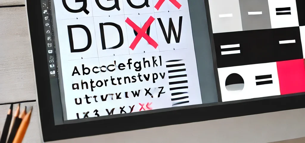
Using multiple different fonts in one design can make it look cluttered and unorganized. It’s best to stick to two or three fonts at most to ensure cohesion and readability in the design.
2. Poor Element Alignment
If the elements in your design are not aligned properly, the design may look messy and uncomfortable to view. Make sure to evenly distribute elements to achieve visual balance.
3. Ignoring Contrast
Contrast helps highlight important elements in the design. If the colors are too similar, it can be difficult for the viewer to distinguish the details. Use contrast wisely to draw attention to the key parts of the design.
4. Neglecting White Space
White space is not wasted space; it is an important part of the design. Using white space effectively helps make the design clearer and more focused on the main content.


